Lesson 6
The Slope of a Fitted Line
Let's look at how changing one variable changes another.
6.1: Estimating Slope
Estimate the slope of the line.

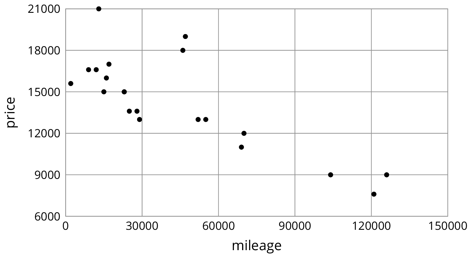
6.2: Describing Linear Associations
For each scatter plot, decide if there is an association between the two variables, and describe the situation using one of these sentences:
- For these data, as ________________ increases, ________________ tends to increase.
- For these data, as ________________ increases, ________________ tends to decrease.
- For these data, ________________ and ________________ do not appear to be related.
6.3: Interpreting Slopes
For each of the situations, a linear model for some data is shown.
- What is the slope of the line in the scatter plot for each situation?
- What is the meaning of the slope in that situation?
\(y=5,\!520.619x-1,\!091.393\)
\(y=\text-0.011x+40.604\)
\(y=0.59x-21.912\)
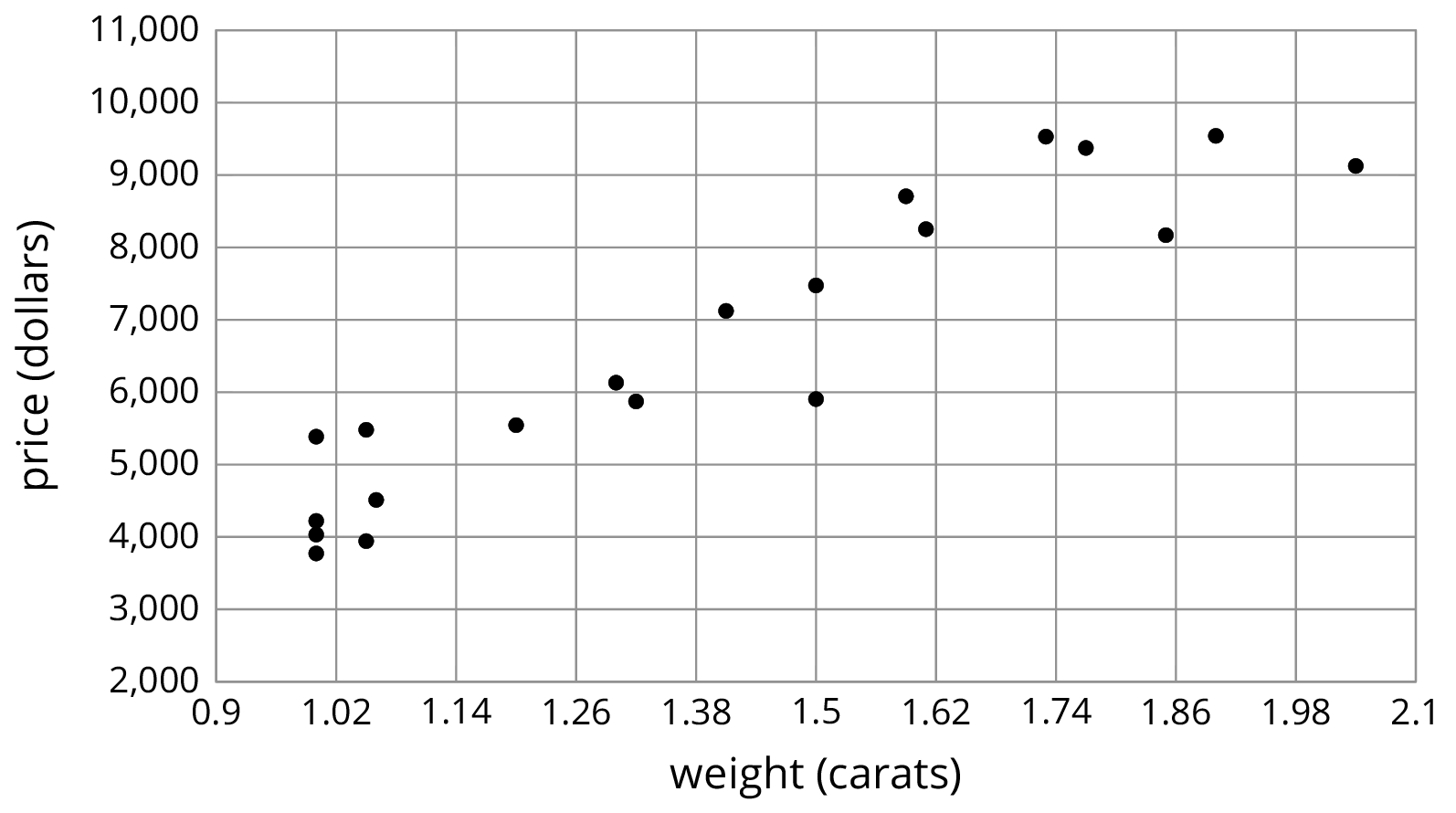
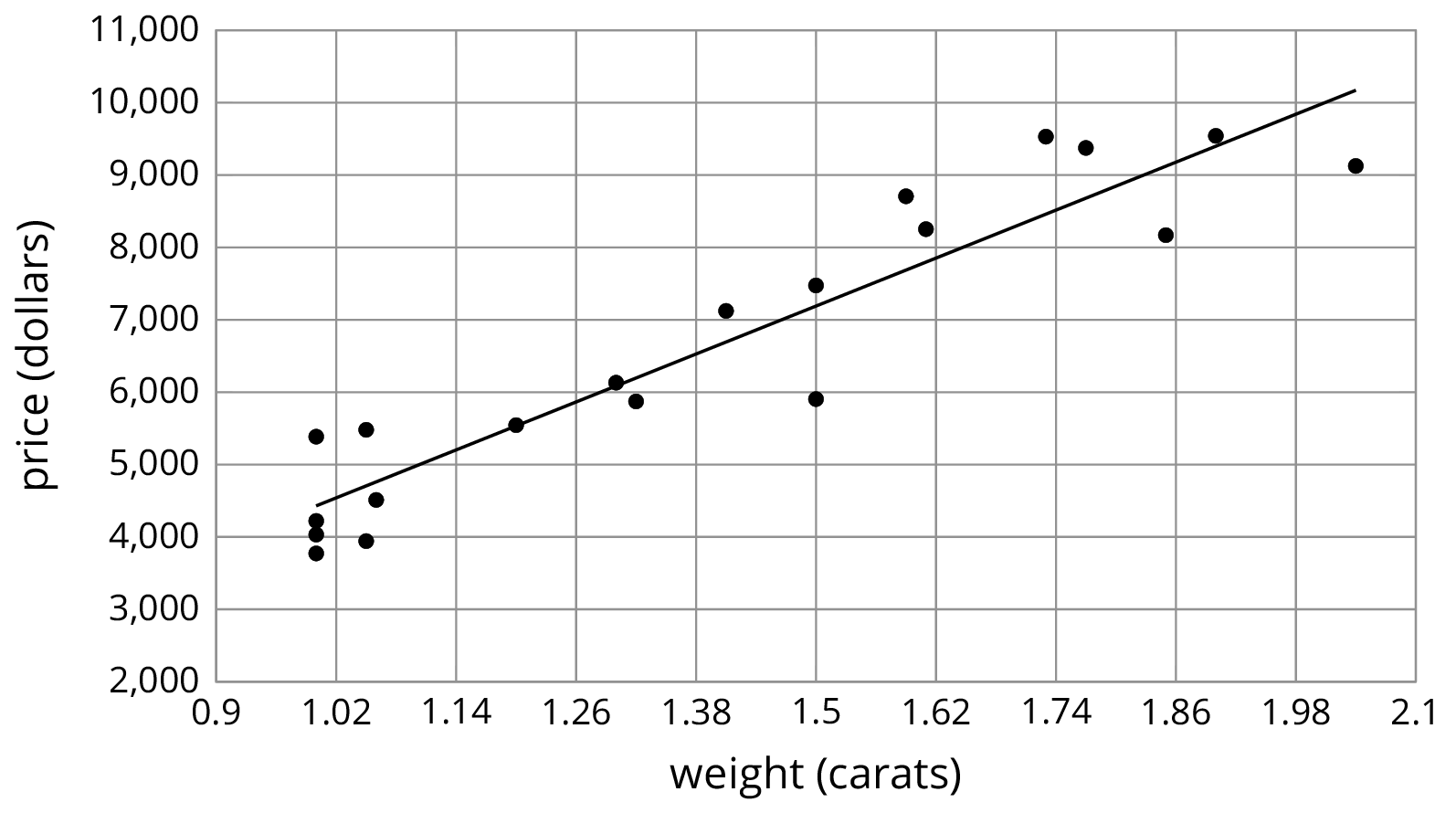
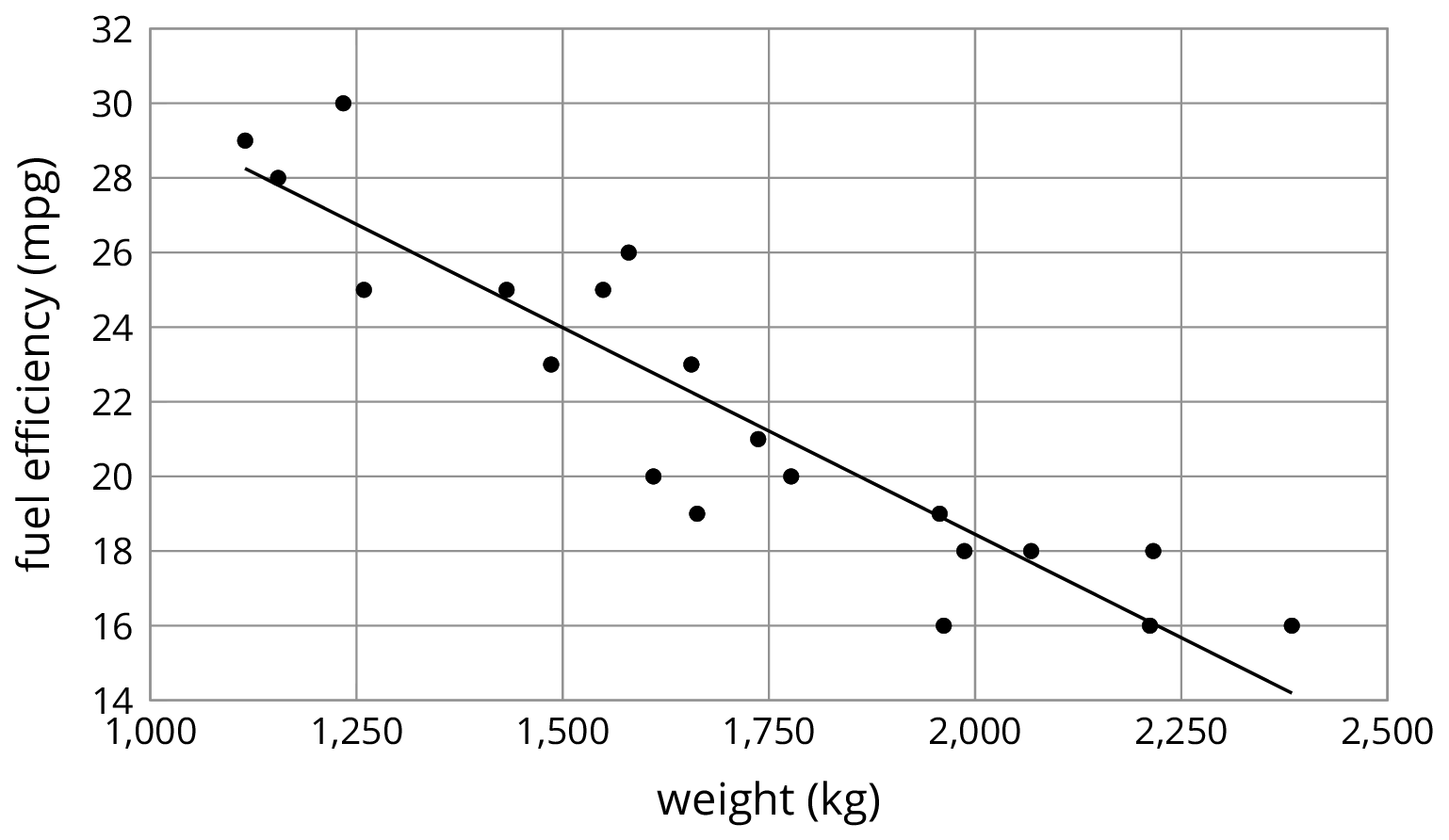
The scatter plot shows the weight and fuel efficiency data used in an earlier lesson along with a linear model represented by the equation \(y = \text-0.0114 x +41.3021\).

- What is the value of the slope and what does it mean in this context?
- What does the other number in the equation represent on the graph? What does it mean in context?
- Use the equation to predict the fuel efficiency of a car that weighs 100 kilograms.
- Use the equation to predict the weight of a car that has a fuel efficiency of 22 mpg.
- Which of these two predictions probably fits reality better? Explain.
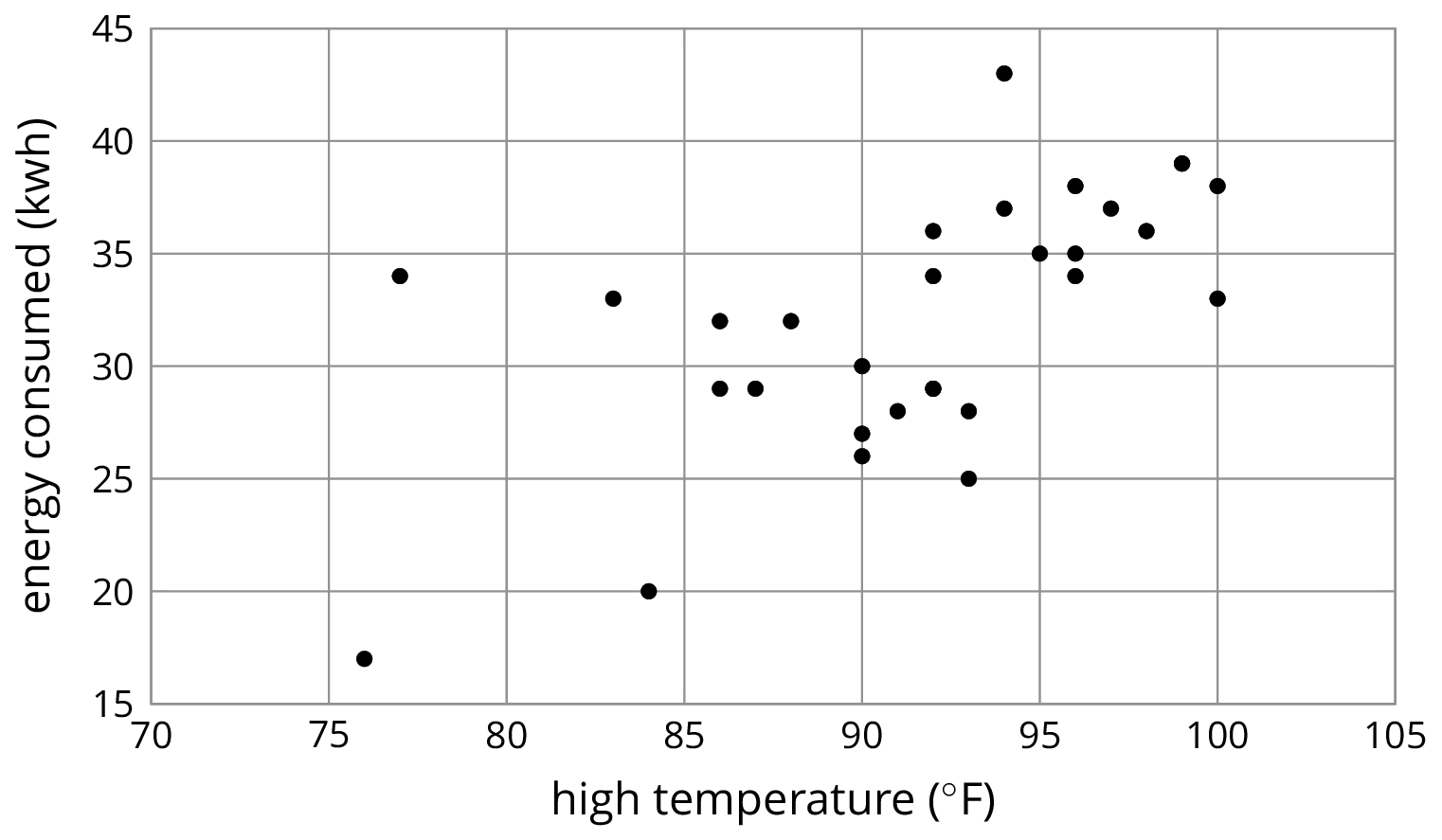
6.4: Positive or Negative?
-
For each of the scatter plots, decide whether it makes sense to fit a linear model to the data. If it does, would the graph of the model have a positive slope, a negative slope, or a slope of zero?

- Which of these scatter plots show evidence of a positive association between the variables? Of a negative association? Which do not appear to show an association?
Summary
Here is a scatter plot that we have seen before. As noted earlier, we can see from the scatter plot that taller dogs tend to weigh more than shorter dogs. Another way to say it is that weight tends to increase as height increases. When we have a positive association between two variables, an increase in one means there tends to be an increase in the other.

We can quantify this tendency by fitting a line to the data and finding its slope. For example, the equation of the fitted line is \(\displaystyle w = 4.27h -37\) where \(h\) is the height of the dog and \(w\) is the predicted weight of the dog.

The slope is 4.27, which tells us that for every 1-inch increase in dog height, the weight is predicted to increase by 4.27 pounds.
In our example of the fuel efficiency and weight of a car, the slope of the fitted line shown is -0.01.

This tells us that for every 1-kilogram increase in the weight of the car, the fuel efficiency is predicted to decrease by 0.01 miles per gallon. When we have a negative association between two variables, an increase in one means there tends to be a decrease in the other.
Glossary Entries
- negative association
A negative association is a relationship between two quantities where one tends to decrease as the other increases. In a scatter plot, the data points tend to cluster around a line with negative slope.
Different stores across the country sell a book for different prices.
The scatter plot shows that there is a negative association between the the price of the book in dollars and the number of books sold at that price.

- outlier
An outlier is a data value that is far from the other values in the data set.
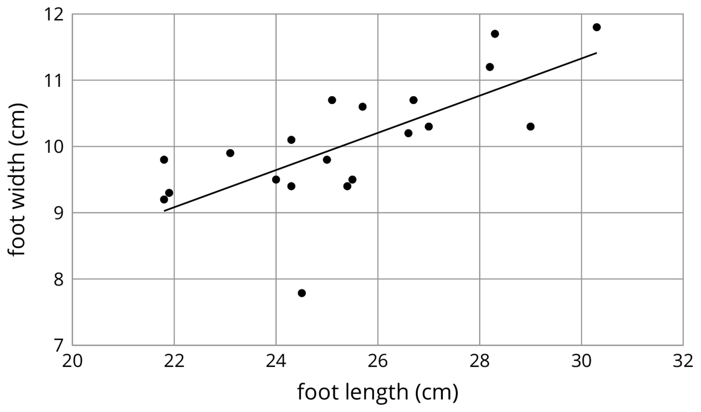
Here is a scatter plot that shows lengths and widths of 20 different left feet. The foot whose length is 24.5 cm and width is 7.8 cm is an outlier.
- positive association
A positive association is a relationship between two quantities where one tends to increase as the other increases. In a scatter plot, the data points tend to cluster around a line with positive slope.
The relationship between height and weight for 25 dogs is shown in the scatter plot. There is a positive association between dog height and dog weight.